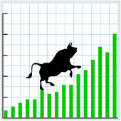
 A trendline is a straight line connecting a number of points on a graph. It is used to analyze the specific direction of a group of values set in a presentation. There are two kinds of trendlines, an uptrend with values going higher, and a downtrend where the direction of the line gradually drops to the lower values.
Predicting the future
Trendlines allow businesses to see the difference in various points over a period of time. This helps foretell the possible path the values will take in the future. This can help reveal performance, value, and competitiveness of specific products and services, along with the relevant business departments, such as sales.
By knowing how to add a trendline to your presentation, you can create a graphical representation of the values you have computed. This will enable the user to easily comprehend and analyze the message you are trying to imply.
Add a trendline to your Excel chart
If you use Office 2013, you can create a trendline to complement your reports by right clicking the data series (e.g., the information that has been graphed to charted) in the chart you created. This will show a drop down menu where you can find the option to Add a Trendline. This will open another window where trendline types are available. You can choose the one which suits the chart you created.
Another option is to click your chart and look at your Excel menu bar. Head on to the added tab, Chart Tools, and in the Design tab, click Add Chart Element where another drop down list will appear. At the bottom part of this, you will see Trendline, click this for a list of options that will best fit your data.
- Exponential trendlines: This creates an uneven arc that is more curved at one side than the other on charts with values that fluctuate. It cannot be used when you have a zero or a negative value in your chart.
- Linear trendlines: Most common when the values in your chart create a straight line. This shows a continuous rise or fall trend that indicates a path it will steadily continue in the future.
- Logarithmic trendlines: Where there is a sudden increase or decrease in the chart, which then continues on to become level.
- Polynomial trendlines: Used for larger set of data with fluctuating values. If the direction of your values continuously changes, then this option could suit you best.
- Power trendlines: Almost the same as exponential, only in this, the arc is more symmetrical.
- Moving average trendlines: Used when your points seem to have too many ups and downs. This levels out the extreme fluctuations for easier trend analysis. Depending on the number of periods set, this option gathers the values together and computes its average which is then used as the trend point.
Whatever your reports, it is easier to spot the direction of values when you use graphical tools to show data. This ensures that reports are easily understood, along with the trend at which your values are headed as a result of the lines appearing in the chart. The ability to fully grasp the value and use of trendlines and other Excel functions will allow you to use your computer programs to unlimited use. Want to know more? Get in touch!